Case Studies
Let’s work together!
See something you like? Talk to us today.

Creative Director (UK)
Kati has a wealth of experience in design, advertising, management and public relations. With a strength for branding and concept development, Kati produces digital and print design that is second-to-none.

Web Developer
Like a really tall and slightly scruffy ninja, Andrew is our secret web assassin. He’s been an integral part of Kingfisher for many years, and is an html samurai of the highest order – defeating evil code and putting websites on the path of righteousness on a daily basis.

Senior Designer
The work-out king of the office, Sean loves taking every design brief we can throw at him and lobbing it back with style while he tries not to swallow his earbud cord. He’s also a wicked illustrator and social commentator.

Designer
A talented Designer, Erin has thrown herself into design life, constantly upgrading her skills and showing a knack for the big picture in social media and emphasising brand. All under the watchful eye of her dog, Freddie.

Copywriter
As a content writer and designer, Lynne likes to exercise both her visual and ‘wordy’ sides in creative ways. She delights in finding just the right words to express something, and is an extremely nit-picky member of the grammar police. She enjoys the challenges of learning about the businesses that she writes about, creating content that speaks to people, and trying to run.

SEO Manager
Murthy has more than 7 years SEO experience successfully managing over 100 global clients across 18 different languages. Murthy is a good team player who is committed to staying on top of the latest technologies.

Creative Director (AUS)
A naturally talented soul, Mary brings her considerable creative clout to Kingfisher Creative, working on new concepts, looking after regular clients, writing copy, taking photos and even venturing where less adventurous designers will go, on a mission to make our clients look great in everything they produce.

Owner
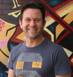
Rohan enjoyed a varied career with roles in advertising management, business development and sales training before starting Kingfisher (formerly Rojay) in 1998. He has a wealth of experience in marketing strategy and execution, brand building, digital marketing and design. In his spare time you’ll find him playing drums for either his cover or original band, playing sport (golf, basketball, or AFL) or just hanging out with his family and enjoying the glorious Queensland weather.